

Brandmark System
Overview
The Aramco Box Logo is available in two equally important colors — Aramco Blue and Aramco Green. Choose the color that provides the best contrast with the background to
ensure it remains clear and prominent.
ensure it remains clear and prominent.
Colors
The primary logo versions are Aramco Blue and Aramco Green. Whenever possible we
use the full-color logos.
use the full-color logos.
Black and White
Approved black and white versions are reserved for specific communications, such as logo lockups and co-branding.
Keyline Logo
The keyline logo features a white outline to improve visibility over busy or low-contrast backgrounds. Use only when primary logo versions are not sufficiently legible. Always use the official keyline logo files provided — do not manually draw or alter the outline.
Keyline one
Keyline Two
Orientation
We use the Aramco Box Logo in both horizontal and vertical orientations,ensuring it adapts effectively to Our flexible identity is designed to work in every scenario. Whether the logo is tall, wide, or small, it must various sponsorship contexts. This always be clear and readable in each approach reflects how the logo is seen by audiences across different platforms.
Horizontal
This is our standard orientation.

Vertical – Up
Rotate the logo 90° anticlockwise so the logo reads ‘upward’.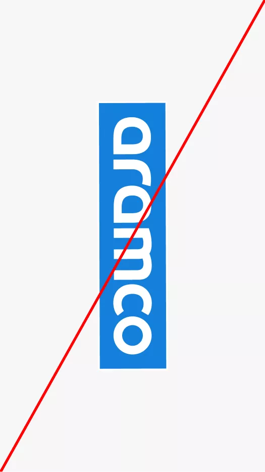
Vertical – Down
Never rotate the logo 90° clockwise, as it would then face downward.
Clear Space
Maintain clear space around the logo equal to at least 100% of its height. No elements should intrude into this space, except when the logo is in a lockup with sponsorship brand elements.
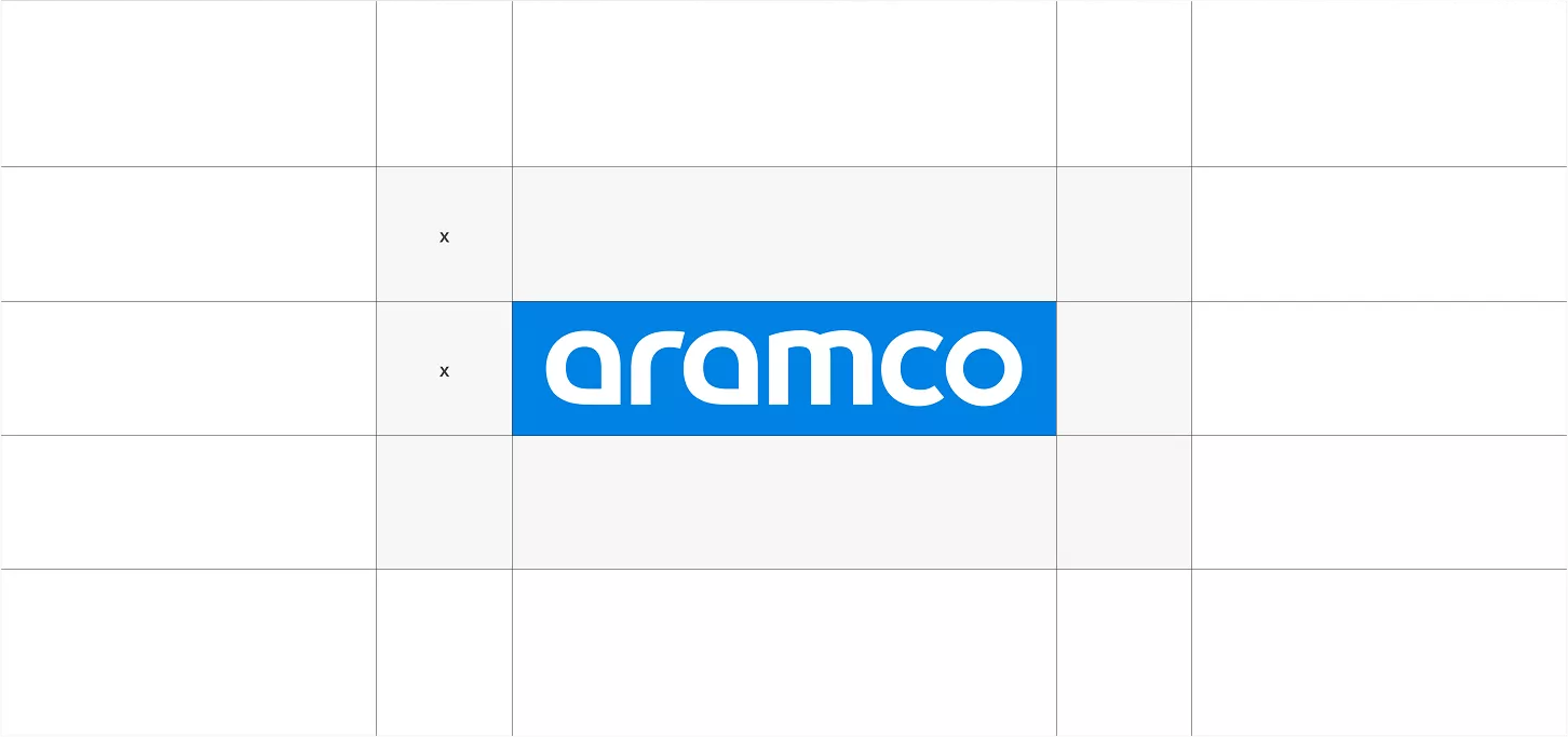
Aramco Box Logo
The ‘x’ shown matches the width of the symbol.
Scaling Principles
The logo is designed to maintain its form at any size. Scale should be chosen based on audience,communication goals, and tone.
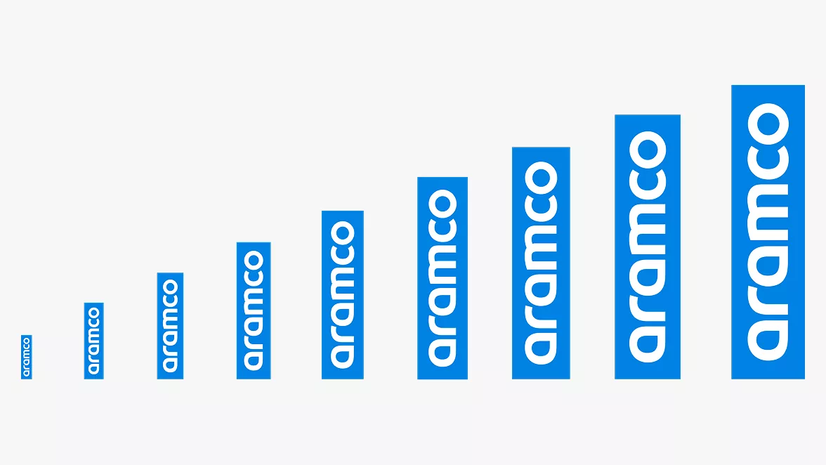
Scaling in Composition
Ensure identity elements are easily seen and understood in the layout. If they are difficult to read, they may be too large or too small. Do not crop identity elements unless done with specific intent and approved as part of the design.
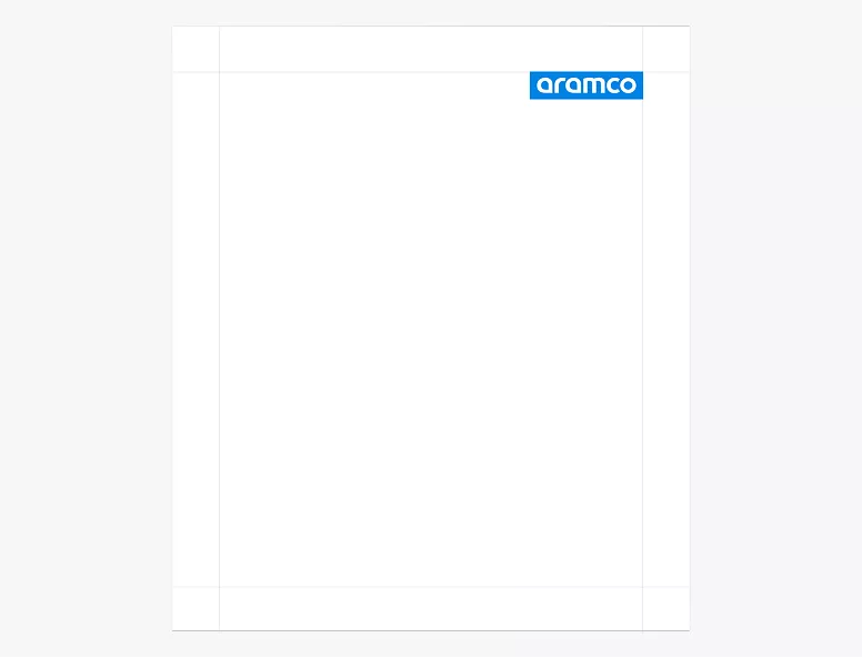
Logo scaled correctly for the composition

Logo is too small for the composition
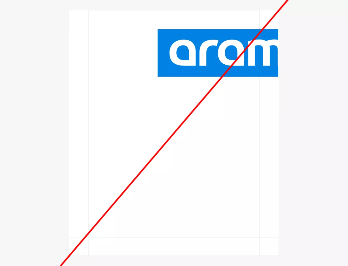
Logo is too large for the composition
Legibility
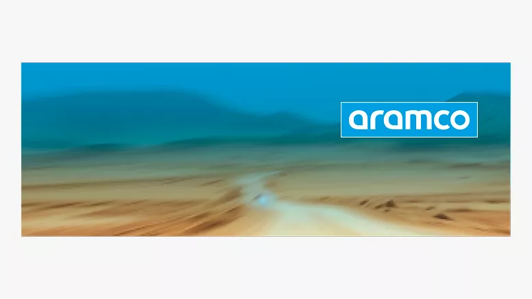
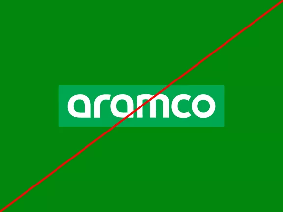
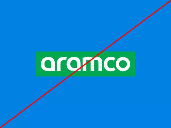
To ensure the logo remains clear and impactful, avoid placing it on backgrounds—solid, patterned, or photographic—that are too close in tone to the logo’s colors. For example, avoid placing green or blue logos on similar-colored backgrounds. When low contrast is unavoidable, use the provided keyline version to create separation and preserve legibility. Do not manually draw the keyline — always use the official files. Prioritize high contrast to maintain clarity and brand integrity in all applications.
Low-Contrast Solution
Use the provided keyline for clear legibility on low- contrast backgrounds.
Poor Contrast Example
Avoid placing the logo on similar-colored backgrounds to maintain visibility.
Placement
Placement shapes how identity elements are perceived. Corner placements suit informative or direct communications; centered placements create a more expressive and impactful presence.
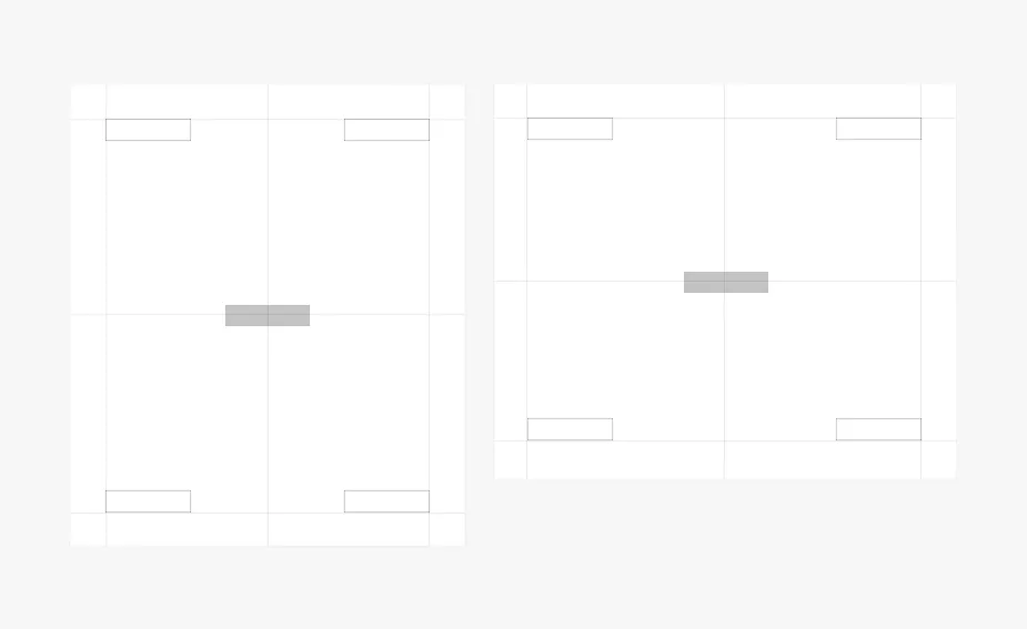
Center Placement
Placed in the center, the identity acts as an expressive element.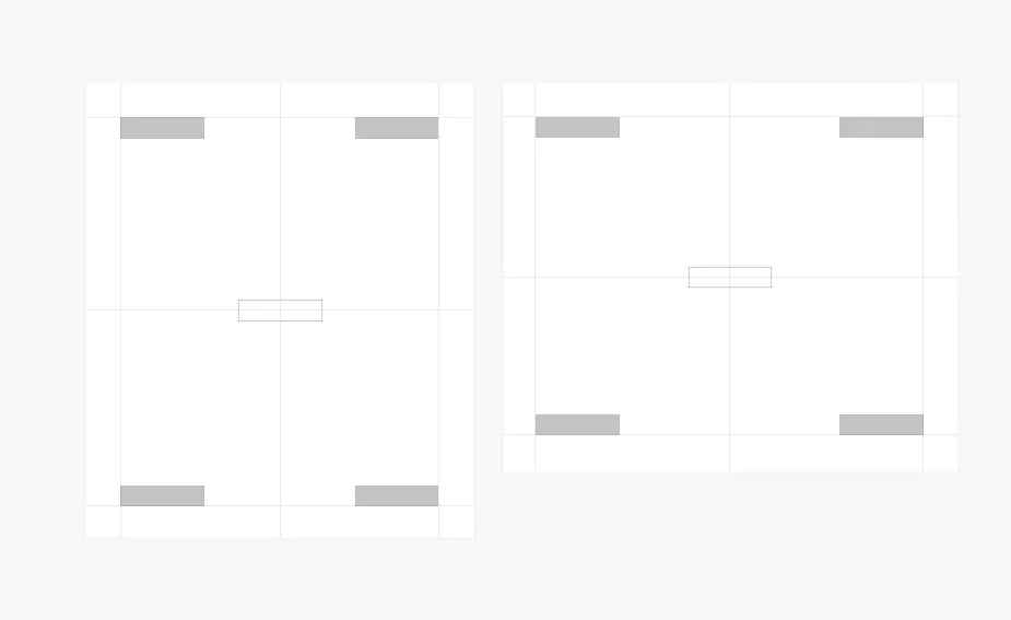
Corner Placement
Placed in the corner, the identity acts as a signature.
© Aramco Brand Portal 2026