

Typography System
Primary Typeface
Weights
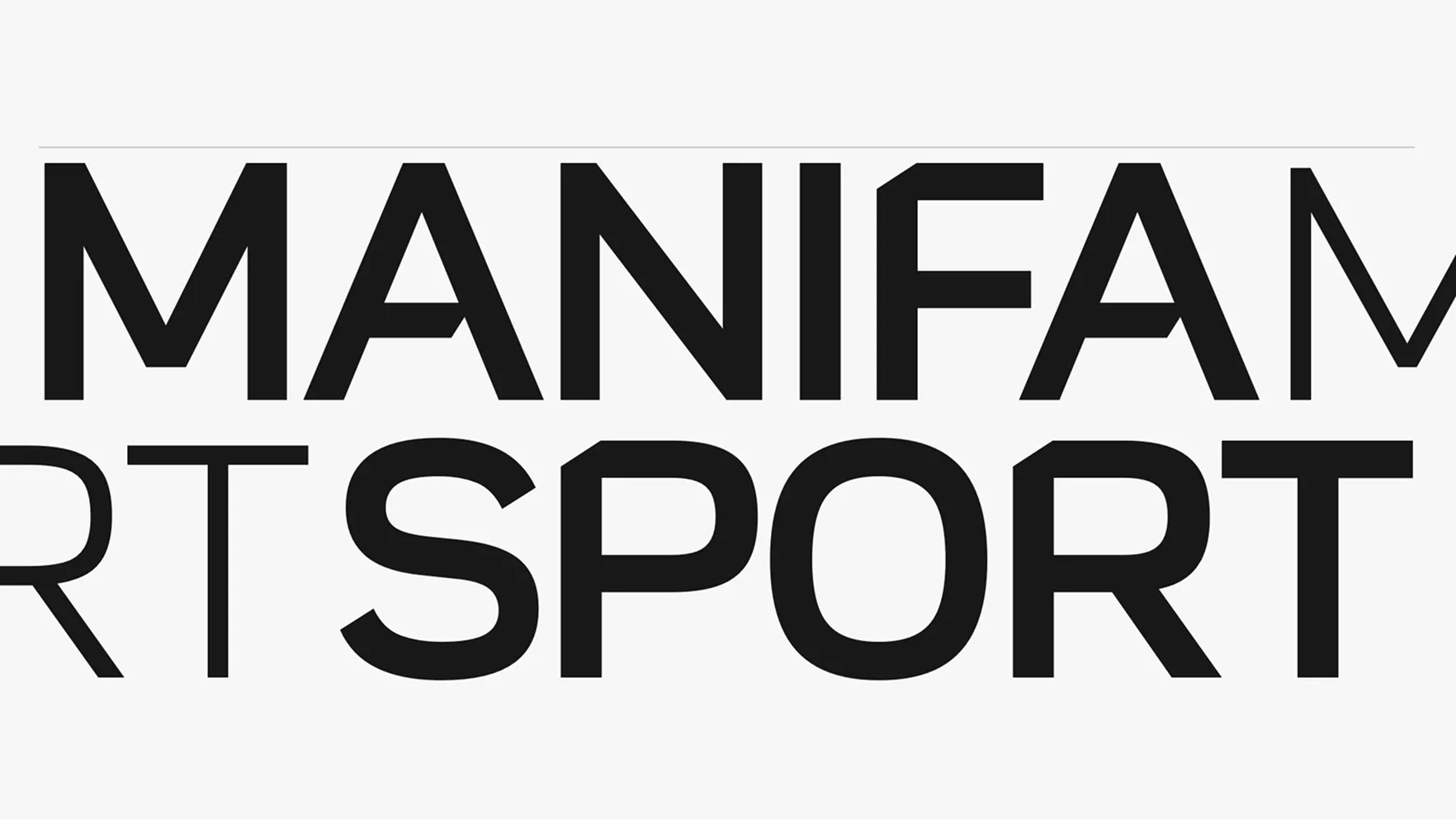
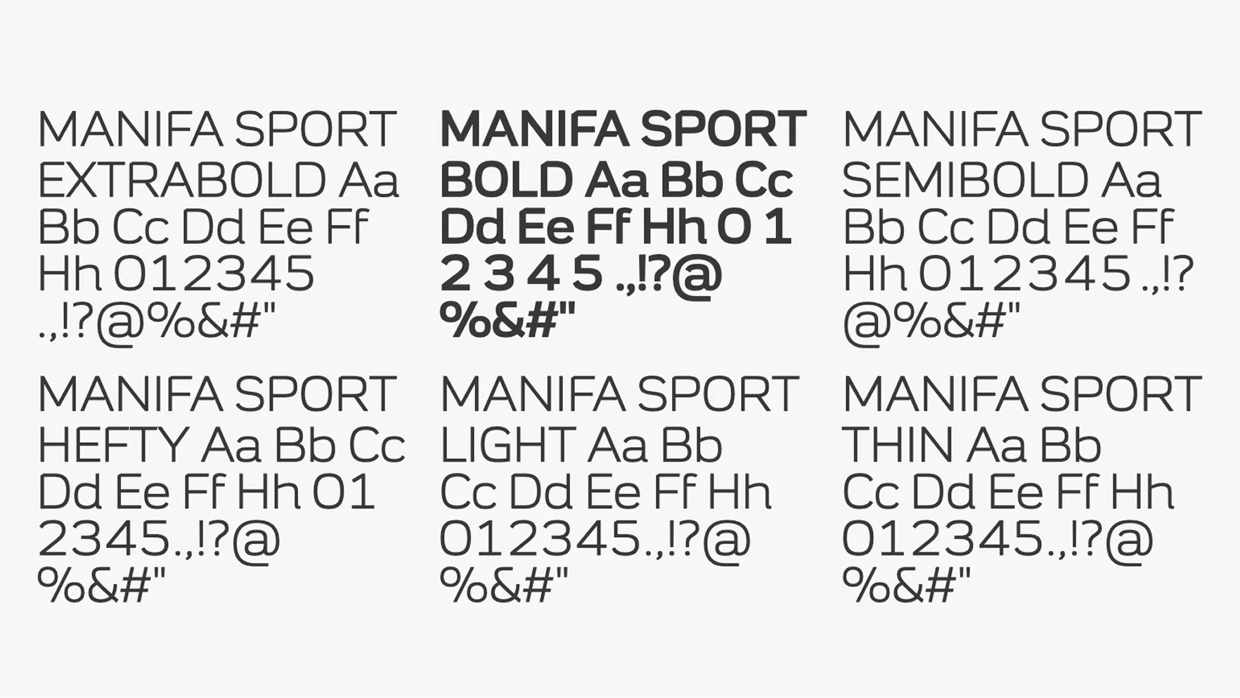
Manifa Sport is available in seven weights, from ExtraBold to Thin. Each weight maintains clarity and legibility for sponsorship visibility. The range allows flexibility while preserving the bold identity of the brand.
Download Manifa Sport Font
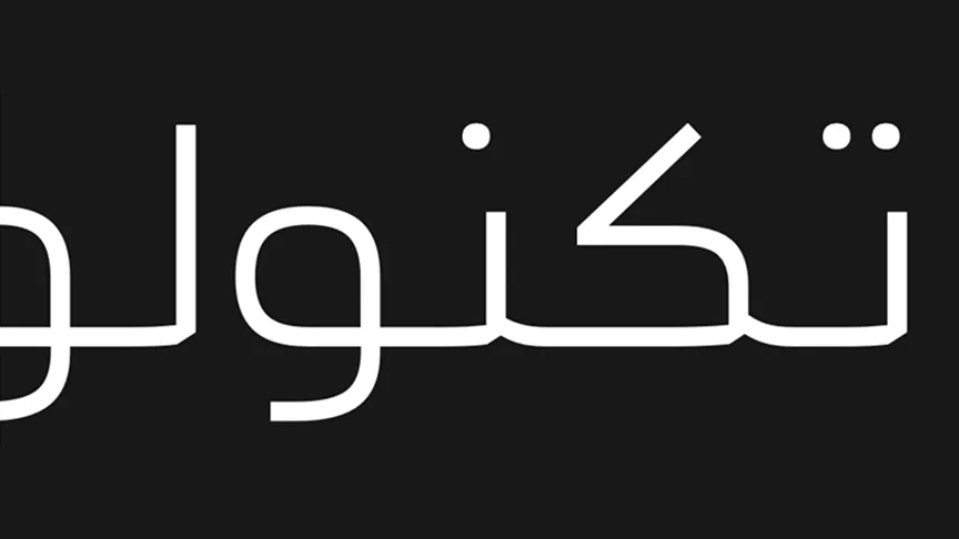
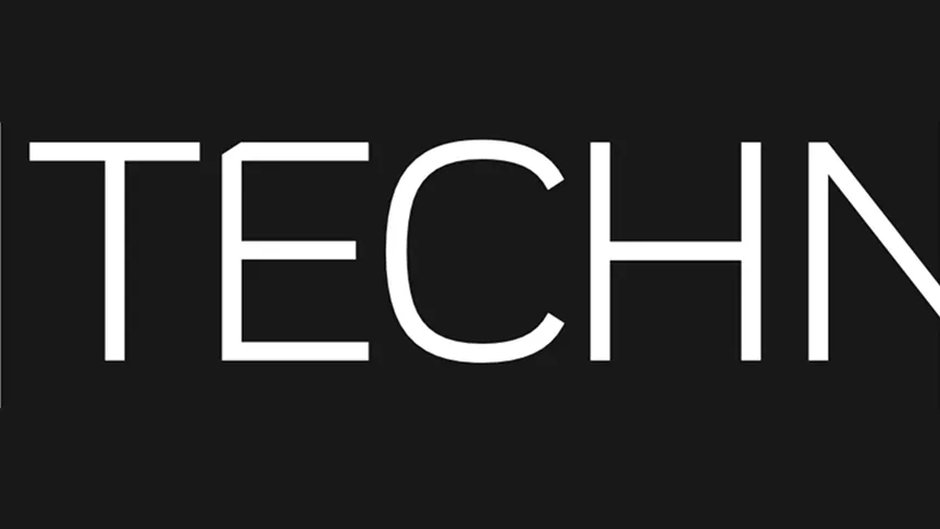
Dual-Script Capability
2
Latin Secondary Typeface
 Ghawar is used for body copy and long Latin text. Designed for clarity and easy reading, it works well in both print and digital applications.
Download Ghawar Font
Arabic Secondary Typeface
 Haradh is used for body copy and long Arabic text. Clear, legible forms ensure comfortable reading in all sponsorship communications.
Download Haradh Font
Combining Our Fonts
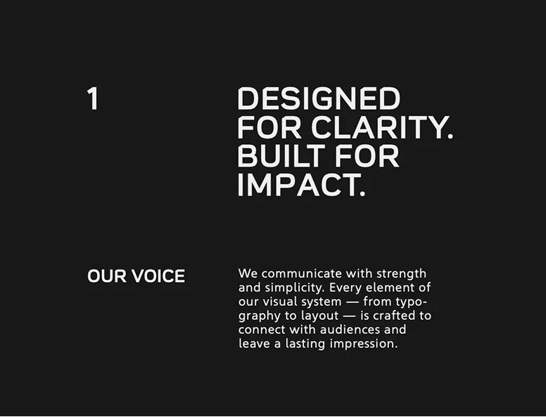
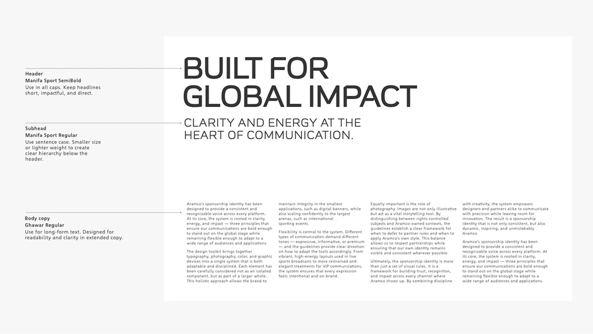
Headline and body pairing: Manifa Sport for impact, Ghawar for clarity
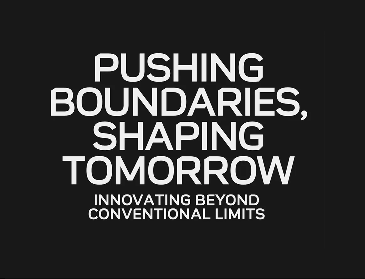
Strong, bold headlines use Manifa Sport in uppercase for maximum emphasis
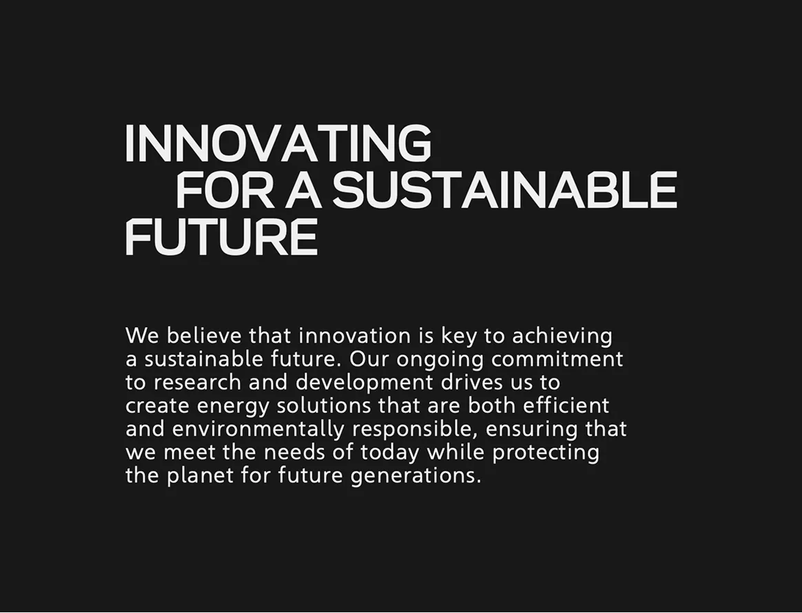
Balanced hierarchy: Manifa Sport headlines supported by Ghawar body copy forreadability
Use of Caps
Uppercase can be effective for emphasis, but it should be used with restraint. Avoid setting long and impactful, ideally between 3–7 words. Use Manifa Sport for titles,while Ghawar should remain in passages in all caps, as it reduces sentence case for body copy and legibility and overwhelms the reader. Keep uppercase titles short longer text.
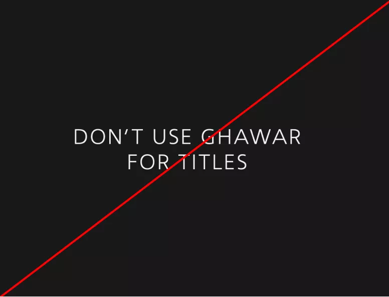
Don’t use all caps in Ghawar
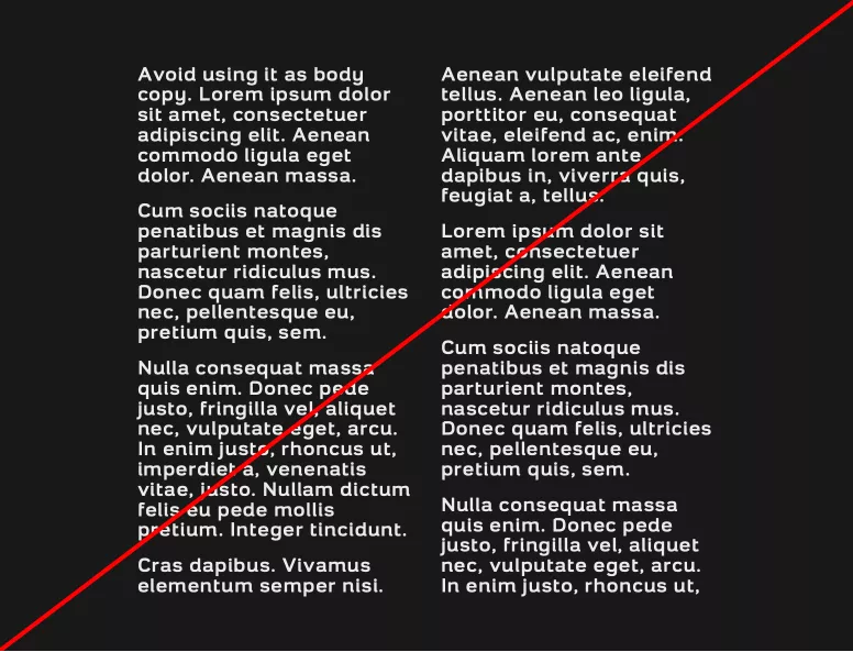
Don’t set long passages in all caps
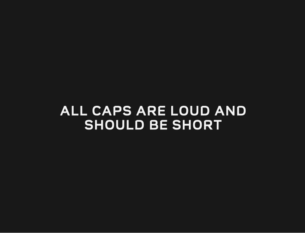
Use all caps sparingly. Keep titles in uppercase short and impactful — ideally 3–5 words for maximum clarity and emphasis
Sentence Case
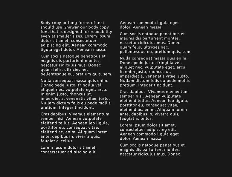
Always use sentence case for body copy and longer text
Do not use Manifa Sport for long-form copy
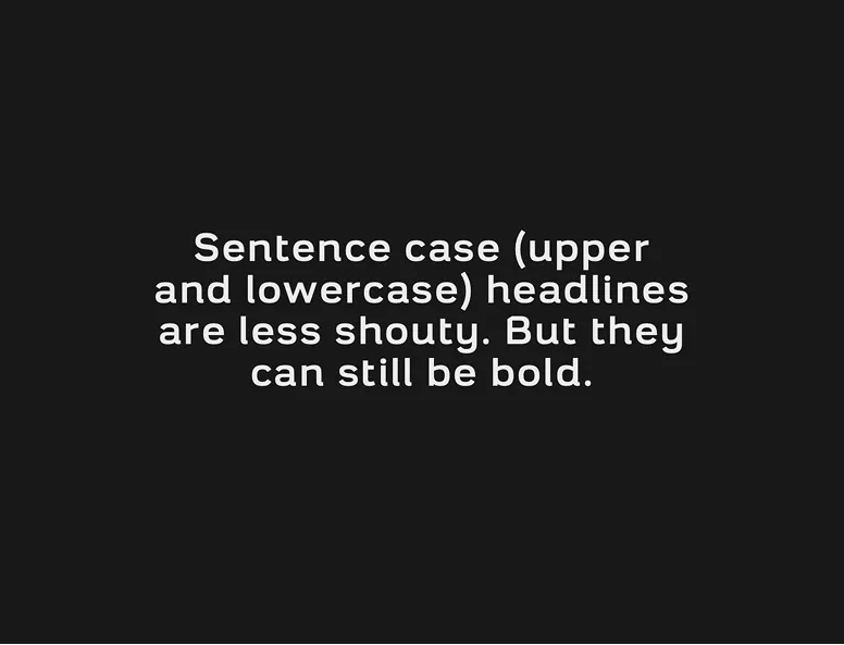
Sentence case can be used for secondary short text elements (under ~25 words)
Hierarchy
Type in Color
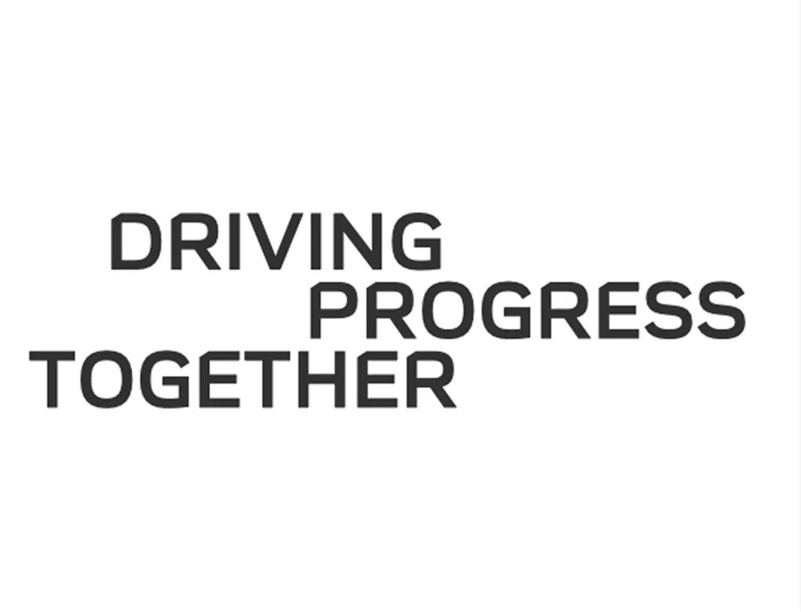
Use dark gray type on light backgrounds
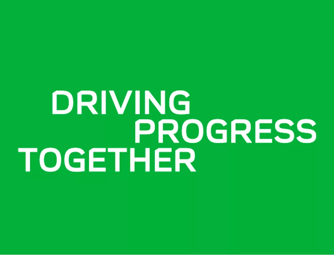
Use white type on dark or colored backgrounds
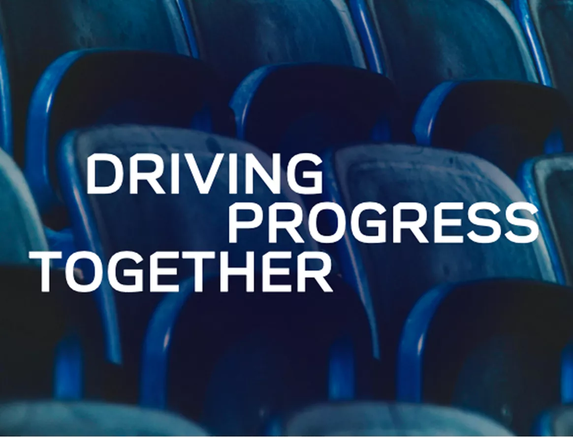
Ensure type color contrasts clearly with the background
Type Don’t
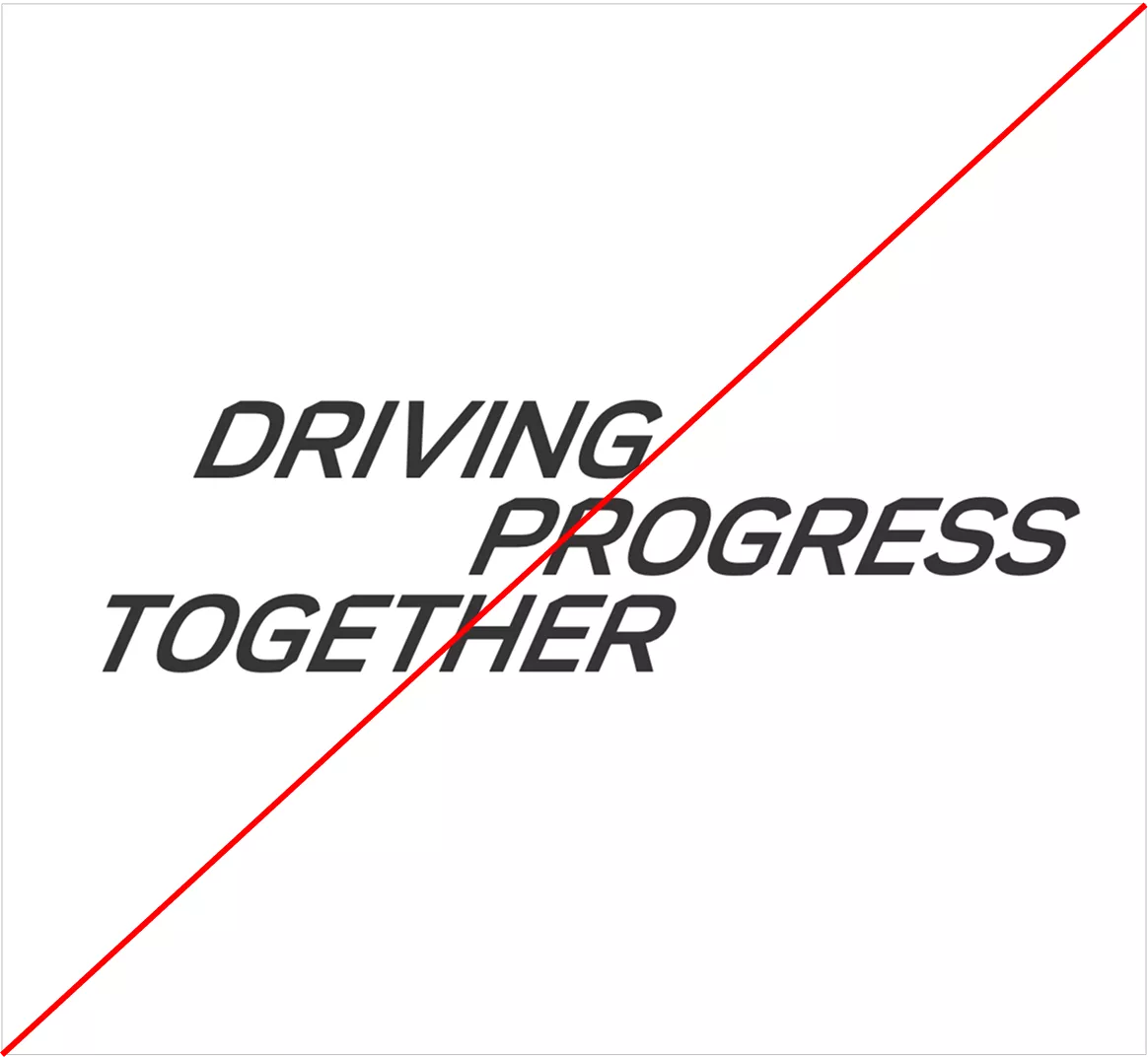
Don’t use italics
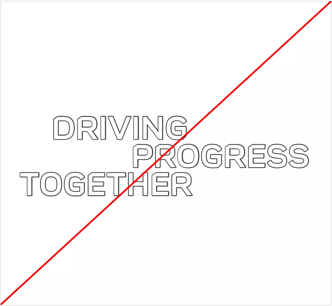
Don’t use outlined or stroked type
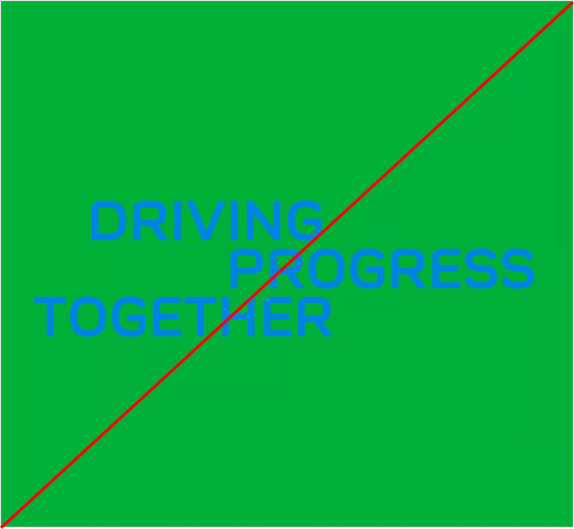
Don’t use low-contrast color combinations
© Aramco Brand Portal 2026