

Graphic Devices
Overview
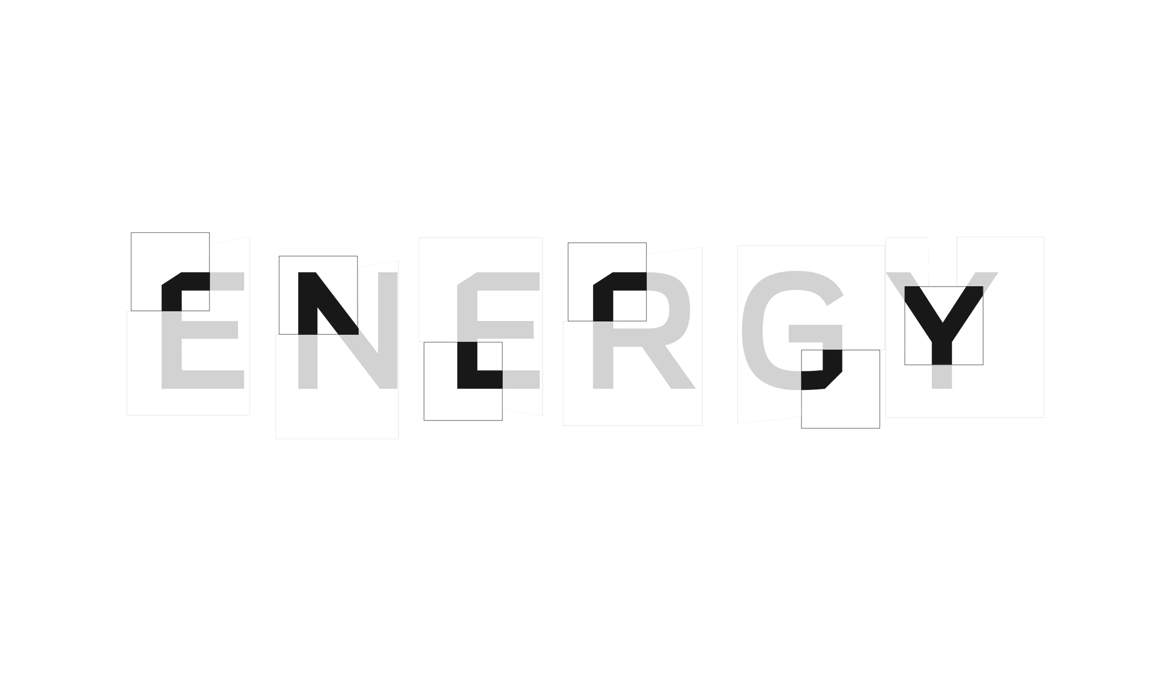
Scale and Grid
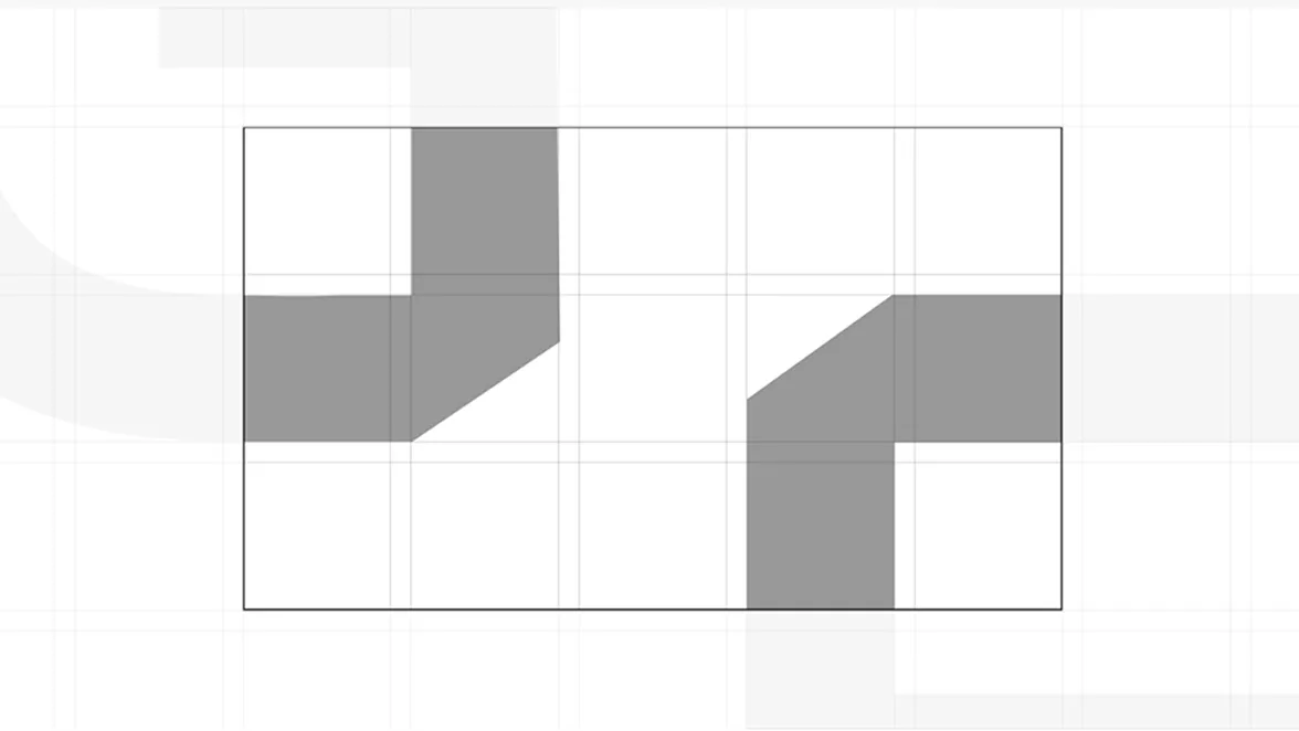
Graphic devices must always be scaled beyond recognition as letters and treated as abstract forms. Use the grid as a guide to size and position them, ensuring balance and rhythm within the composition.At large scale, the devices act as bold visual backdrops that structure the layout and add energy. At smaller scales, they risk being read as typography and should not be used.
Note: For instructions on how to build and apply the grid, see the Layout System chapter.
Color
Graphic devices may be filled with two official brand colors. Combinations should remain balanced so text and other elements stay clear and readable.
Acceptable Color Combonations





Color Don’t
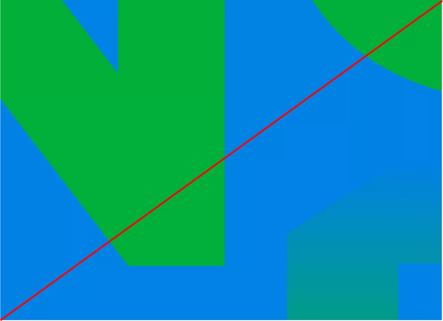
Do not use gradients they create inconsistency
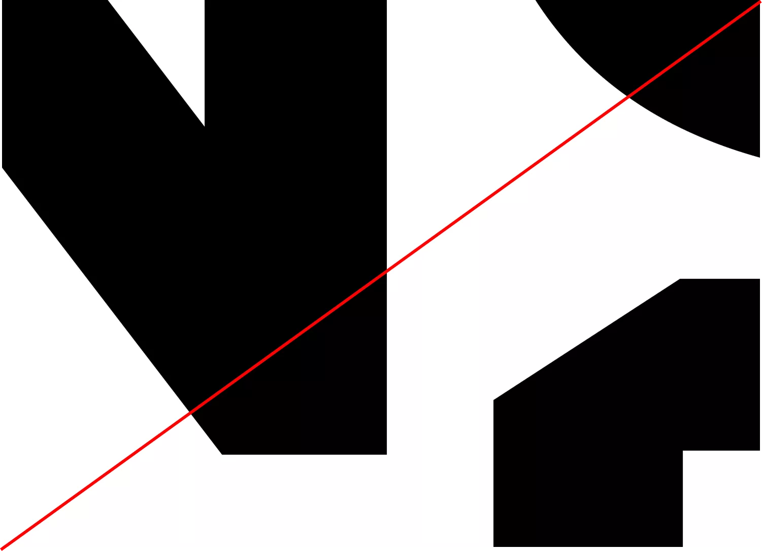
Do not use black and white the contrast is too strong
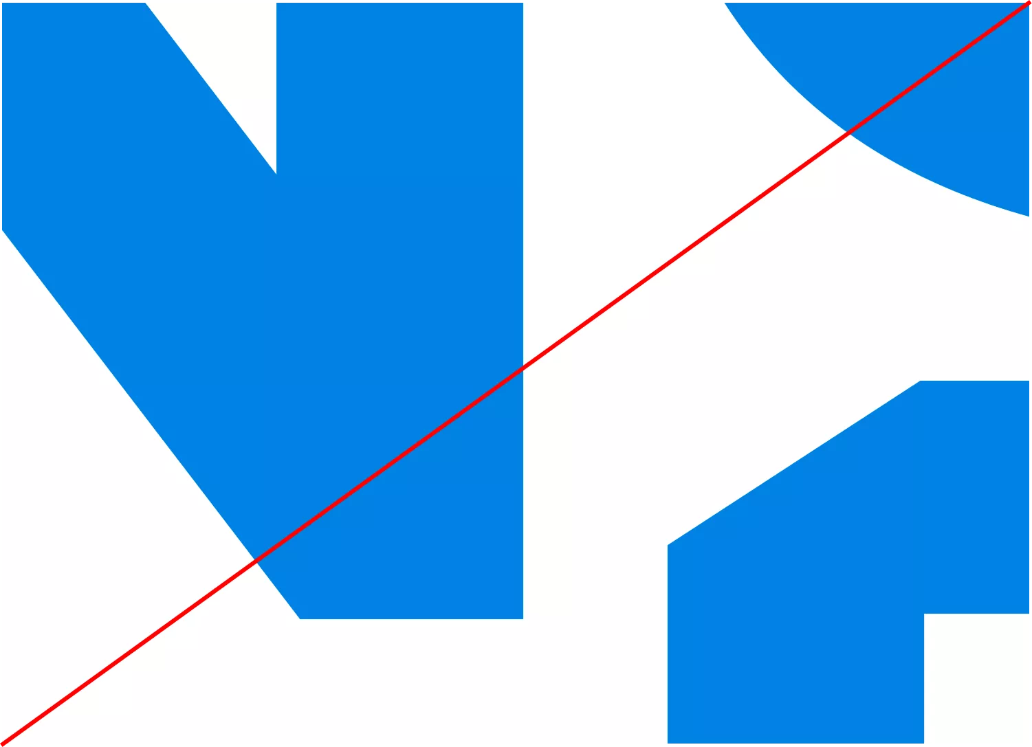
Do not use brand colors with white creates excessive contrast
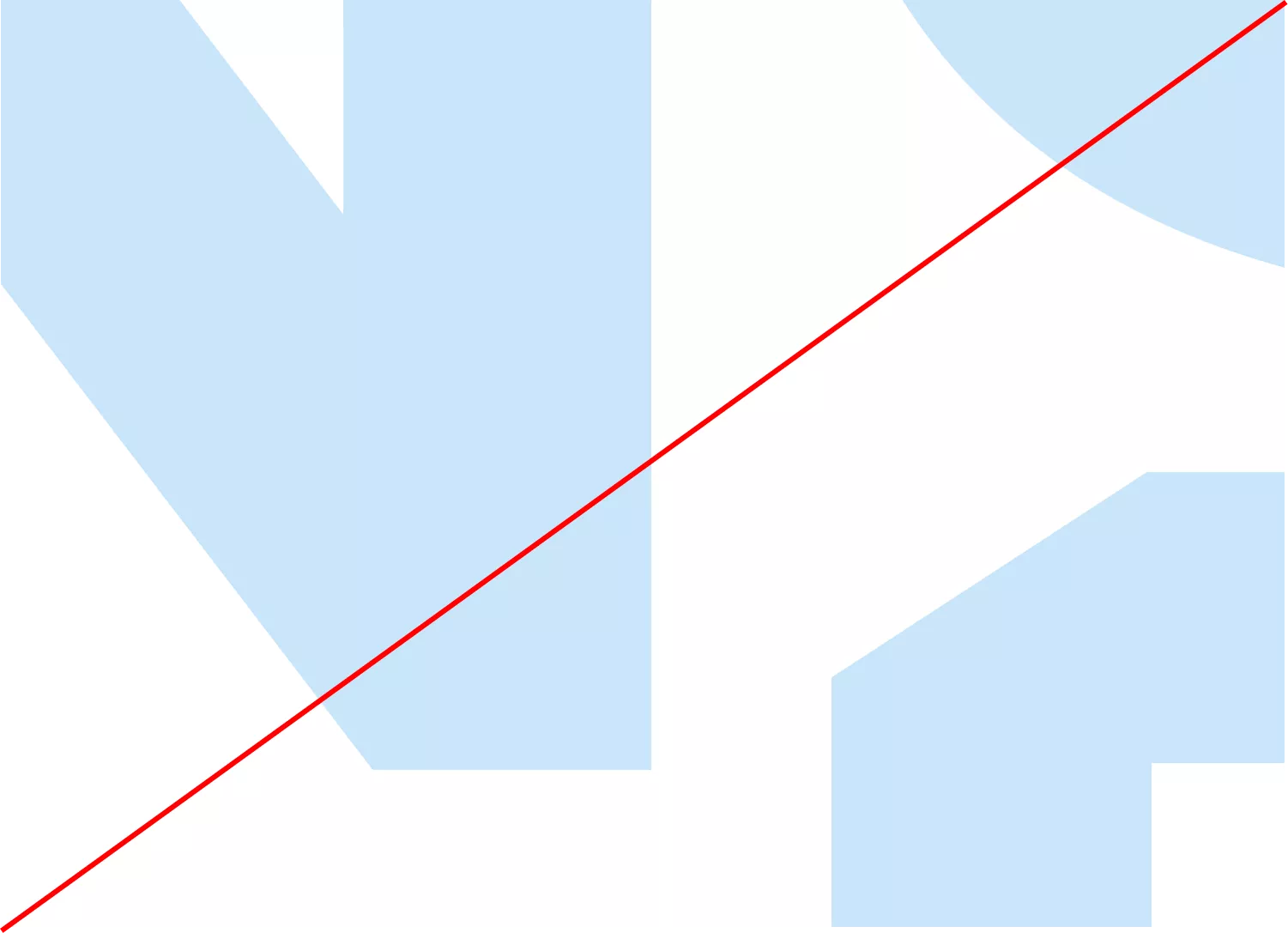
Do not use washed-out tints they appear weak and off-brand
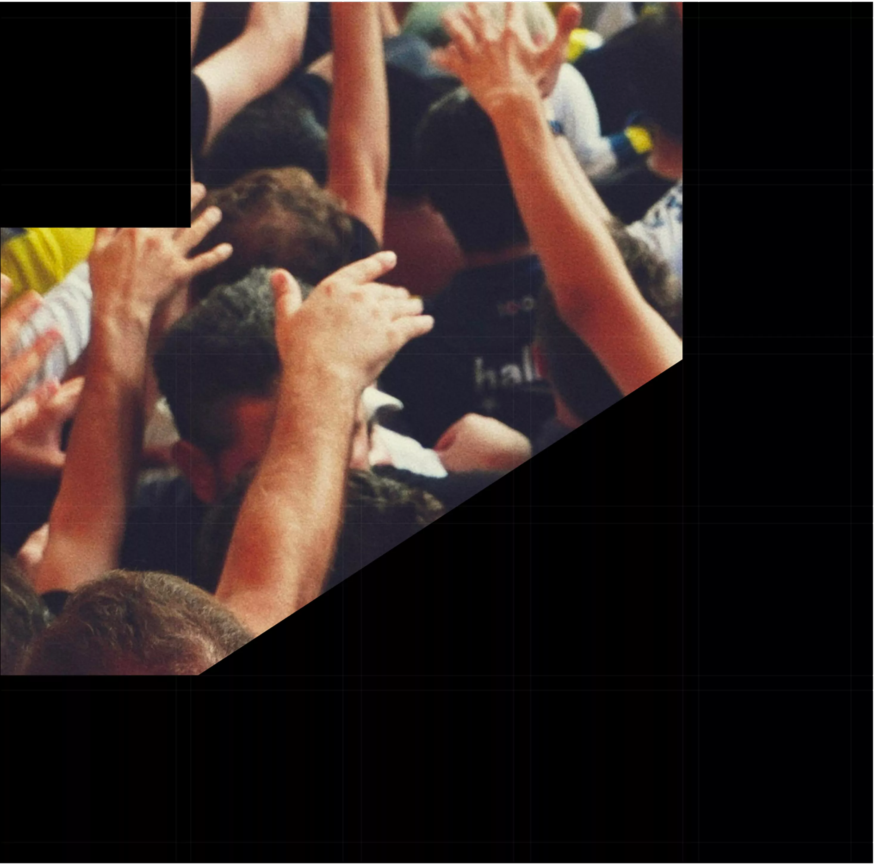
Imagery

Type
Typography should always be clear, legible, and stand out from the background. Use type confidently, maintaining strong contrast and balance with graphic elements.
Acceptable Type Combonations

Use high-contrast type so text is easy to read against the background




Overlap text with graphics when possible to create bold, dynamic layouts

Type Don’t
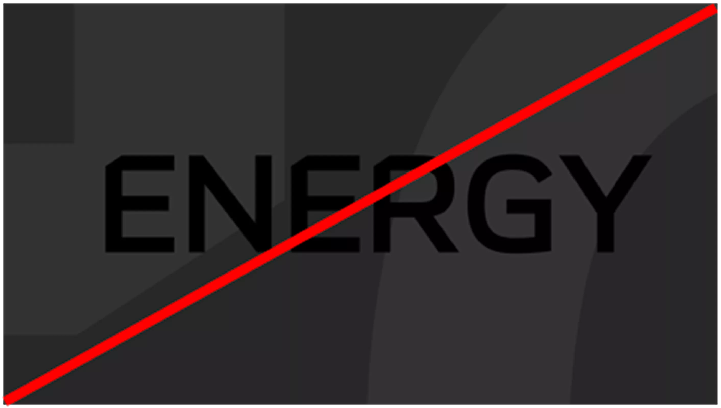
Do not use low-contrast type that blends into the background
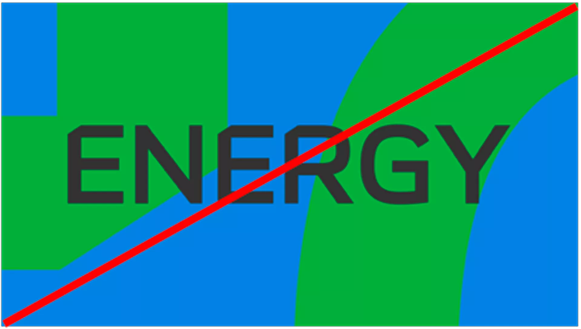
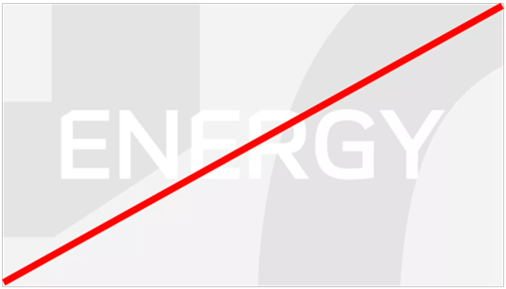
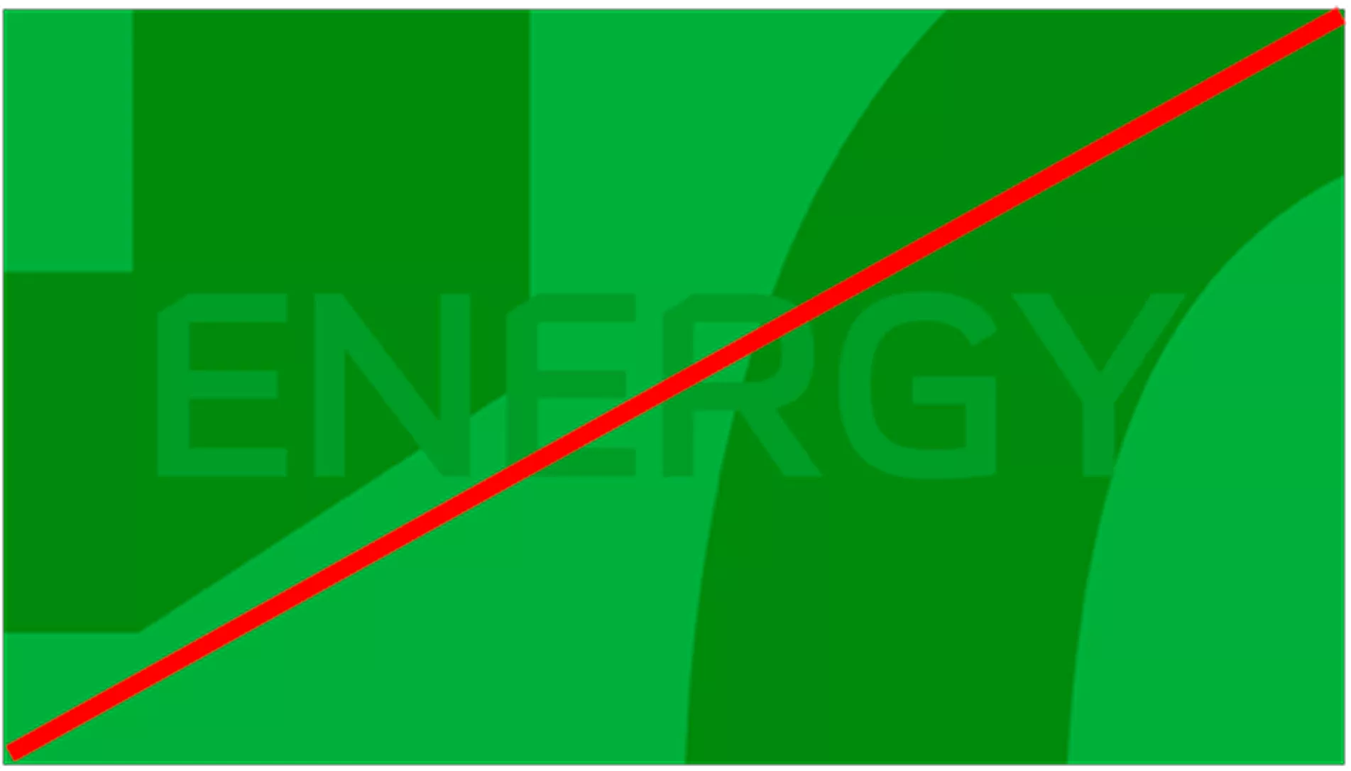
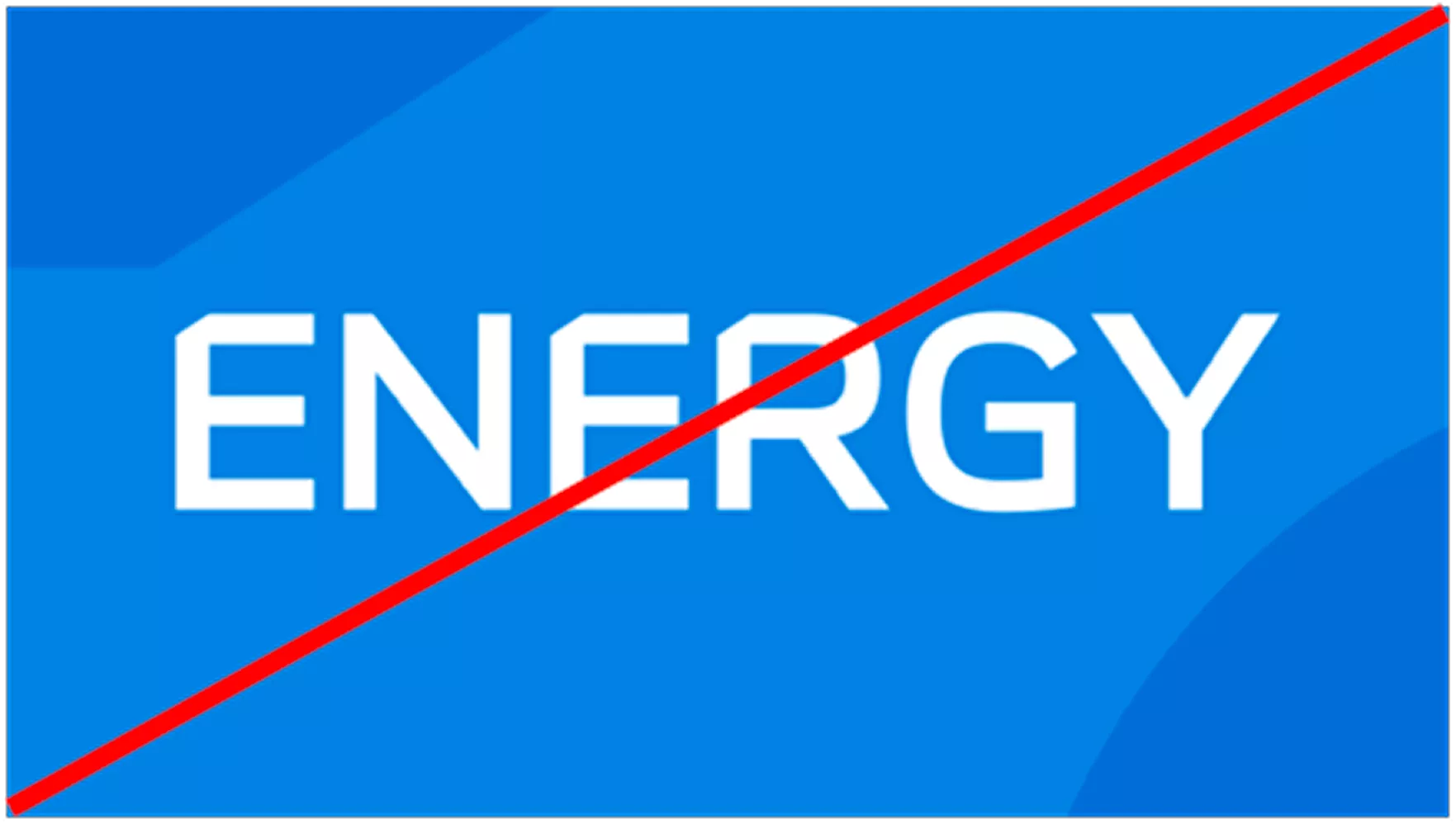
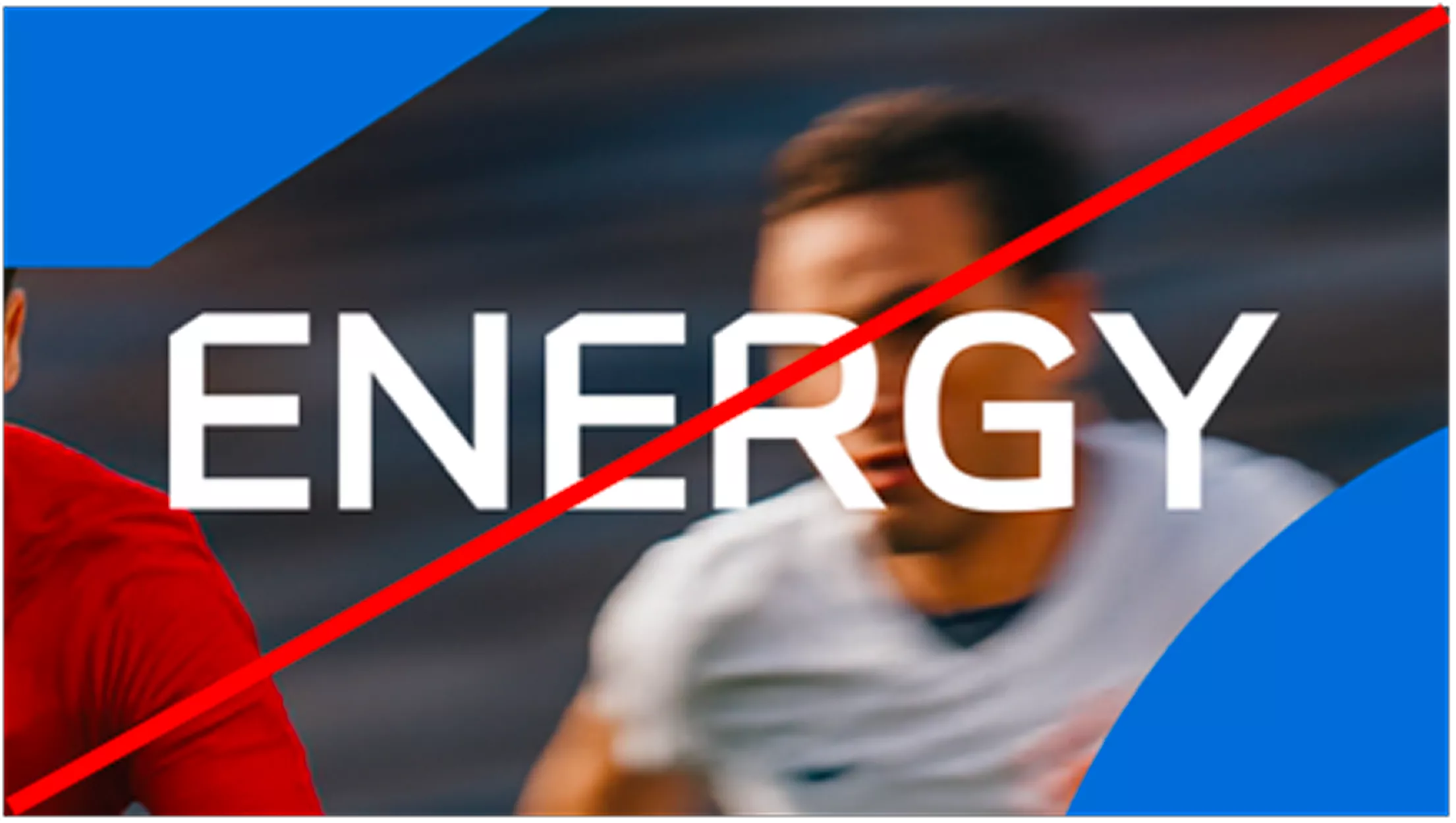
Do not space out graphics excessively to fit the text. Overlapping is preferred
© Aramco Brand Portal 2026