

Layout for Screens and Social Media
Grids
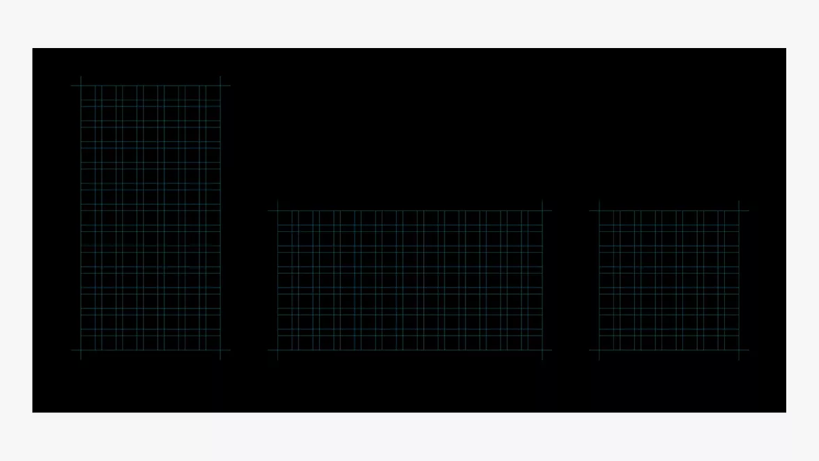
Specifically for screens, we’ve established a versatile square grid suited for various formats. The grid size is determined by the size of the header text.The square grid provides
a structured foundation for organizing text and wordmarks with clarity and consistency.
By dividing the layout into equal-sized squares, designers can align type elements precisely, ensuring balance across compositions. Headings, body copy and captions should snap to both horizontal and vertical grid lines, maintaining consistent spacing and hierarchy. When used effectively, a square grid enhances legibility, reinforces brand cohesion and creates a clean, professional aesthetic across all text-based layouts.
a structured foundation for organizing text and wordmarks with clarity and consistency.
By dividing the layout into equal-sized squares, designers can align type elements precisely, ensuring balance across compositions. Headings, body copy and captions should snap to both horizontal and vertical grid lines, maintaining consistent spacing and hierarchy. When used effectively, a square grid enhances legibility, reinforces brand cohesion and creates a clean, professional aesthetic across all text-based layouts.
Type
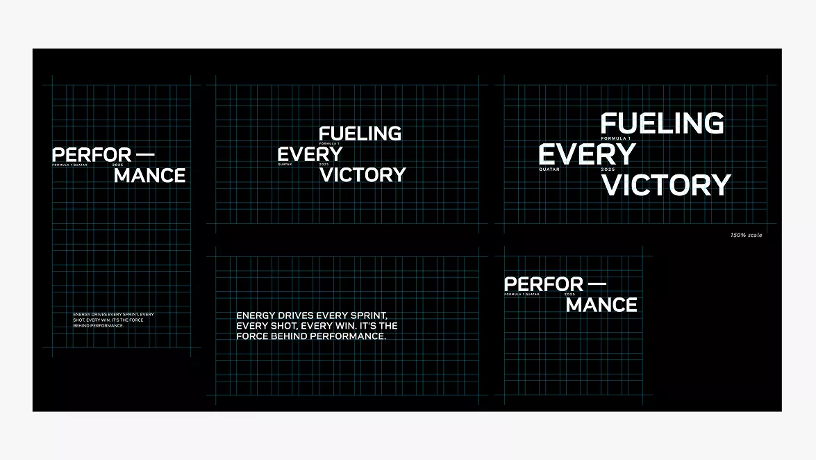
Use the square grid to create dynamic and fluid layouts that introduce contrast and visual tension.Headers can be scaled to 150% to create more impactful headlines, as long as they are either center-aligned or top-aligned to the original grid.
Wordmark
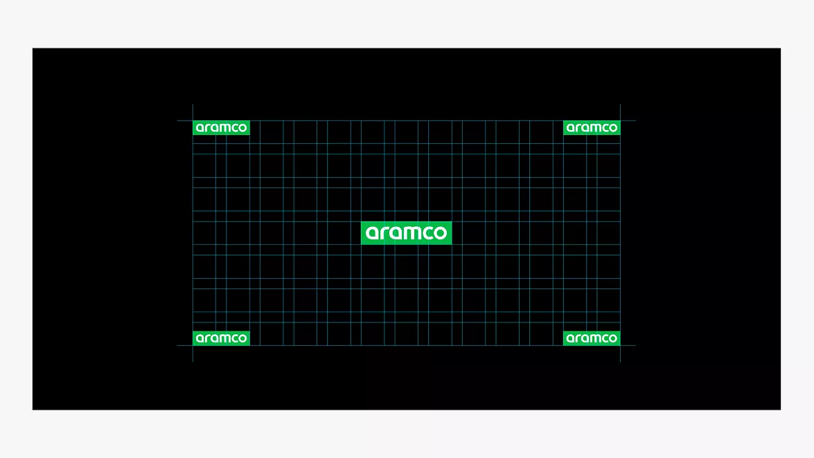
The wordmark must be placed in a corner or centered on the screen, but only one wordmark should appear at a time.
© Aramco Brand Portal 2026